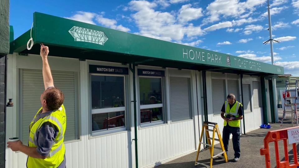
THE new Superstore sign for Home Park has been designed and built using a combination of fresh local talent and traditional methods.
The brief from Argyle to produce a sign that paid tribute to the famous old façade at the Theatre of Greens was given to the students at the Plymouth College of Art and Marcus Rees stepped forward to take on the mission.
“I was in the second year of my degree at PCA and the careers officer had a job on the student pool website, which was for volunteers to do this,” said Marcus.
“I jumped at the opportunity because I love football. I’m a League Two fan and follow Cambridge United, so it’s great to help out another club because I can’t do it for my club back home.
“The brief was to design a façade for the Superstore building. I was in contact with Jamie Yabsley (Argyle’s head of marketing) and he said they wanted to pay homage to the original design, which was made out of bronze and art deco.
“I found some fonts and worked with them on Adobe to make the sign. I’ve now been working with Eagle Signs to complete the project and will be chuffed when the signs go up.”
Once the design element was complete, it was over to the experts at Eagle Signs to create a sign that kept with tradition, both in terms of the look for Argyle and the processes used in production.
“This is a typical job for us to put together individual built-up letters like this,” said Andrew Carter, sales executive at Eagle Signs. “We will fabricate them in polished stainless steel, brushed stainless steel or, as you’ve got here, descaled and then painted.
“Actually fabricating it to logos and text is quite easy, as it is a process we do on a regular basis. It is a traditional method and we’ve been making signage for around 50 years. The lettering on Tamar Bridge was made by us around 30 years ago and the method is the same.
“From the point of view of changes in technology, they have enhanced our industry but the traditional methods of signage are still in place.”

